Advanced Text Effects: Wave, Arch, and Typography Control
Take your keychain designs to the next level with our new suite of text tools. Learn how to bend, warp, and space your text for truly unique 3D prints.
Typography is more than just choosing a font. It's about shape, flow, and spacing. For 3D printed keychains, the way text interacts with the physical form is crucial. We're excited to introduce four powerful new features that give you complete control over your text geometry: Letter Spacing, Circular Text, Arch Warping, and the dynamic Wave Effect.
1. Master Your Spacing (Tracking)
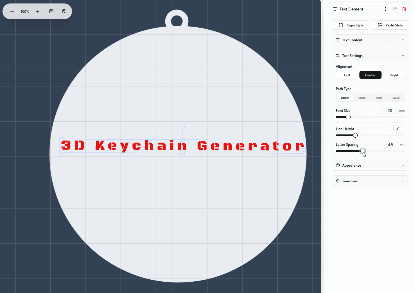
Have you ever used a font where the letters felt too cramped, or maybe you wanted to stretch a short name to fill a specific width? Letter Spacing (also known as tracking) is the solution.
Why You Need It:
- Readability: Small 3D printed text is easier to read with slightly increased spacing.
- Aesthetics: Wide spacing creates a modern, premium look for minimalist designs.
- Fixing Clashes: When using script fonts or bold styles, letters can sometimes merge in unwanted ways. Increasing spacing resolves this.
- Curved Text: Prevents letters from overlapping at the bottom when bending text into an arch.
How to use it: Select your text, and find the "Letter Spacing" slider in the Properties Panel. It defaults to 0 (font's natural spacing). Increase it to spread letters apart, or use negative values for a tight, logo-like fit.
2. Path Types: Move Beyond Straight Lines
Standard straight text is great, but 3D printing allows for any shape. We've added three new path types to break the grid.
⭕ Circular Text
Perfect for round keychains, coins, or wrapping text around a central icon.
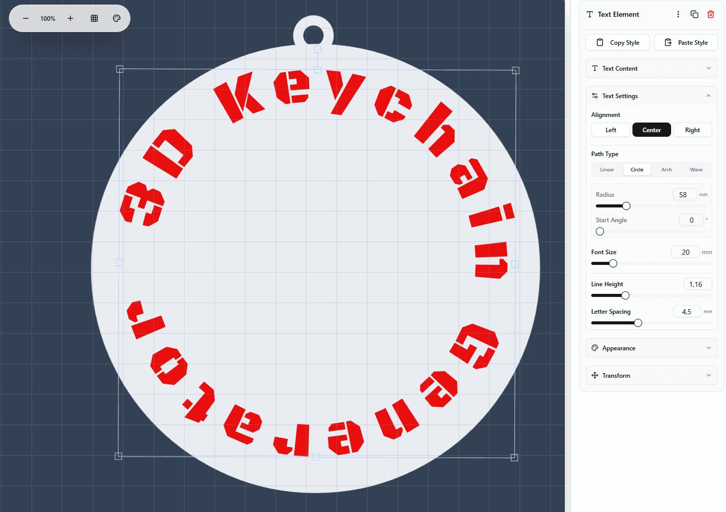
- Radius: Controls how tight the circle is. Smaller radius = tighter curve.
- Start Angle: Rotates the text around the circle. Use 180° for top-centered text.
- Pro Tip: Combine two text elements—one arched over the top, one under the bottom—to create a classic "badge" style emblem.
🏹 Arch Warping
The most versatile tool for rectangular or oval keychains. Unlike circular text which wraps fully, Arch gently bends your text line.
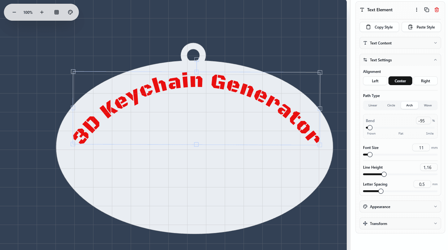
- Bend > 0 (Smile): Curves the ends upwards. Great for optimistic, friendly designs.
- Bend < 0 (Frown): Curves the ends downwards. Creating a "bridge" effect that looks strong and stable.
- Bend = 0: Perfectly straight.
🌊 Wave Effect
For fun, dynamic, and organic designs. This creates a sine-wave motion through your text.
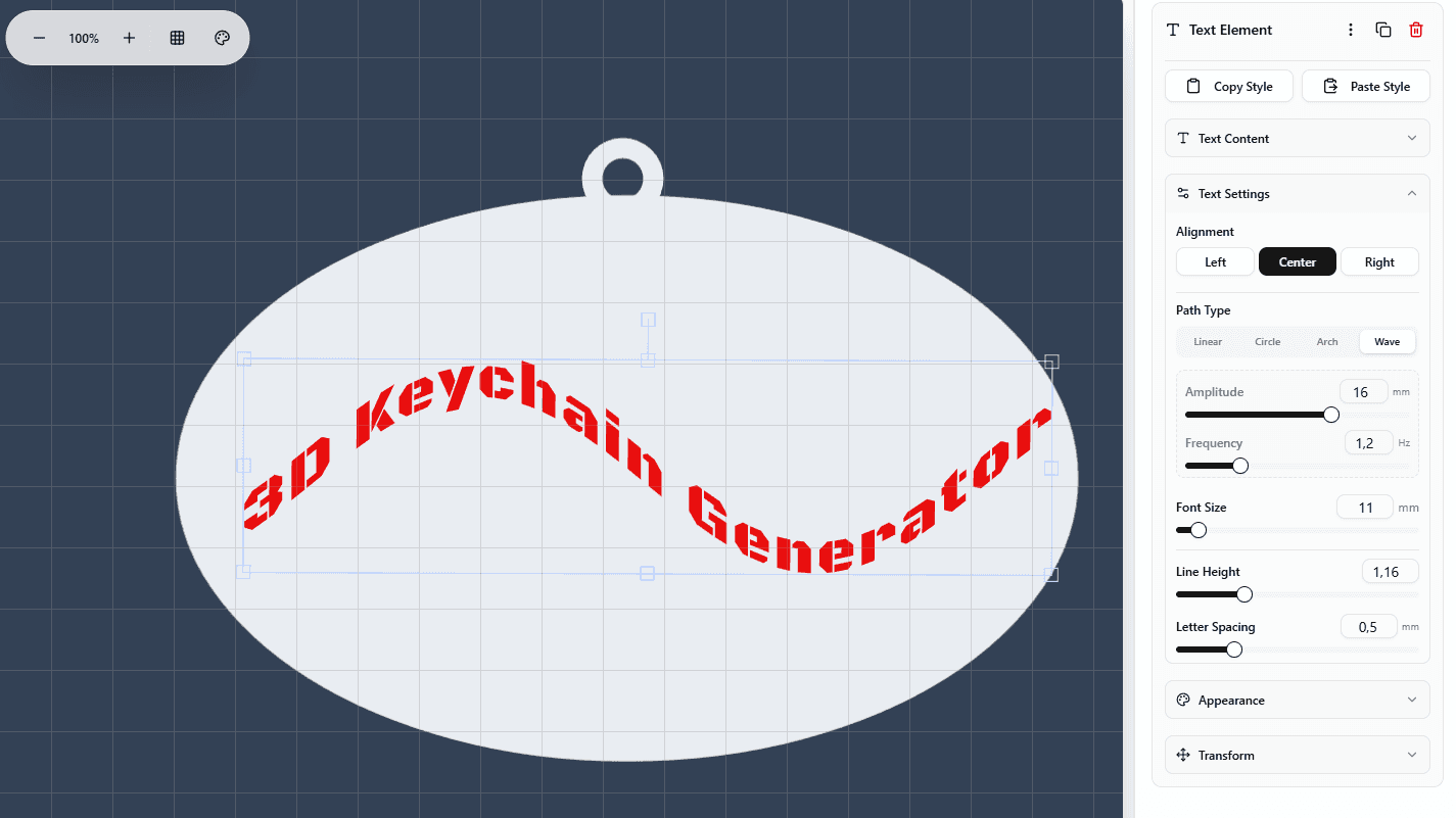
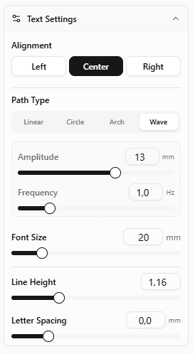
- Amplitude: Controls the height of the wave. How tall are the peaks?
- Frequency: Controls the speed of the ripple. How many waves fit in your text?
- Best For: Surfer themes, playful names, and abstract art pieces.
3. The Power of Combination
The real magic happens when you mix these features. Here are some recipes for stunning designs:
The Vintage Badge
Classic retro look.
- Font: Serif or Bold Sans
- Path: Arch (Bend -30%)
- Spacing: +2.0mm
- Style: Raised Text on Contoured Base
The Modern Minimalist
Clean and sophisticated.
- Font: Thin Sans (e.g., Roboto Light)
- Path: Linear
- Spacing: +4.0mm (Wide!)
- Style: Recessed (Engraved)
The Dynamic Sport
High energy and motion.
- Font: Heavy Italic
- Path: Wave
- Amplitude: 5mm
- Frequency: 1.5 Hz
- Style: Stencil (Cutout)
The Coin Maker
Perfect circular token.
- Base: Circle Shape
- Path: Circular
- Spacing: +1.0mm (to open up inner curves)
- Radius: Match base radius minus 2mm
Technical Note: How It Works
Unlike simple image warping, our engine processes each letter as a vector path. When you apply a Wave or Arch:
- We calculate the precise position of each glyph based on your Letter Spacing.
- We mathematically transform every anchor point of the font vector curve.
- This generates a clean, high-resolution SVG path.
- Finally, our backend extrudes this path into a watertight 3D mesh (STL).
This means your output is always sharp, smooth, and ready for even the highest resolution resin printers.
Ready to Experiment?
These advanced text effects are now live in the design studio. There's no software to install or update—just jump in and start creating your masterpiece.